

Saturday, November 24, 2012
background experience
Well, too close to this mess to judge this page impartially. OH I hate hate hate backgrounds. I realize now more than ever that I draw like a cel cartoon - characters floating against some vague background. Well, must stop beating myself up -- haven't done this in twenty years, have I? No wonder Dave Sim partnered with Gerhard. Always envied him that. Oh well, This is still a step forward from the zipatome days, when I'd find little triangles of 65 line 30 percent dots in my teeth and stuck to my feet...

Saturday, November 17, 2012
Lionheart Blast from past
FB thread got me thinking about the extras in the kickstarter offer that will be the new Lionheart book. PDF digital extras, like sketchbook and color pages. So just for the heck of it, are some Lionheart sketchbook pages from the Quasi Norse saga


Sunday, November 4, 2012
pantomime previews
I haven't posted in a while but have been wanting to. yet I didn't want to spoil a whole 3 pages of story exposition and backstory before it was solid. SO! I decided to hide the text and post the pencils in progress.


Saturday, October 13, 2012
page 5
Posting though I will be tweaking this page a slight bit more. As previous page, a real challenge to keep my interest up in such dull images. Not dissing the work - the majority of the process is getting the faces and body language and the storytelling, and I am pretty content with my work there. But ugh, placing them within a "set"still makes me cringe.
I am still down with a cold, so the rest of the days' art will be in front of the tv. Time to proceed with the script and layouts through end of chapter one. Most of pages 6-7 are scripted, have to work it all the way out and see if chapter runs 8 pages as planned, or 1 or 2 more. Not holding myself to an 8 page max. But 3 chapters max for sure.

I am still down with a cold, so the rest of the days' art will be in front of the tv. Time to proceed with the script and layouts through end of chapter one. Most of pages 6-7 are scripted, have to work it all the way out and see if chapter runs 8 pages as planned, or 1 or 2 more. Not holding myself to an 8 page max. But 3 chapters max for sure.

Monday, October 8, 2012
page 4 finals
Well, 99%. Tweaking still a possibility. TOUGH page - static talking and walking images. Must remember to write more stuff fun to draw like page 1.
I am experiencing that old feeling now, of being incapable of rendering judgement on my own completed pages. Love 'em one minute, cringe the next. Each page is getting between 5 and 8 hours of attention, and that is why I gave up on it as a career. Making an average of $35 a page, at 6 hours per page, minus materials - $$ on boards, ink, nibs, pencils.. do the math. Not a living.
The 'free" nature of the materials of this project makes a huge difference. I am still buying pencils and sketchpads and treated myself to a fine intuos tablet - and the on-demand printing model makes publishing not too painful.
Anyway, like the title sez: page 4.
Saturday, September 29, 2012
pencils, 4 and 5
The next two pages have reached the pencil stage and I have reached the dinner and bad movie stage. Must attempt to finish battleship. G4, you sunk my self respect.
SOUND FX of a big KEEE-RASH missing top of page 5.

 ANYWAY.. things are just kinda visually dull at this point, sorry, But the story unfolds...
SOUND FX of a big KEEE-RASH missing top of page 5.


Wednesday, September 26, 2012
page 3 pencils
The title page emerges on page 3, and the title was the last thing to come into place. It came to me in a flash 15 minutes ago; they often do just appear after days of fruitless thought. Still confused? The story WILL connect by page 8, at least in terms of how these elements relate and what is happening. Sort of. This is a good example of how things evolve, almost none of the dialogue on this page is as it appeared in the script. The only surviving line is "put down that meat cleaver!" Much of it was altered to express that they were looking into kitchen by splash panel. I thought I'd be able to express it visually, but it got too busy. Figured a way to do it through dialogue. This is how i have always done it, and why it is difficult to work with a writer. I edit on the fly, constantly, to fill in details or set a stage or even just alter dialogue to fit in the space. Damned near impossible for me to be comfortable with a writing partner, unless they surrender total control over finished product.
I will be adding some hand lettered screaming to lead into "run for your lives"
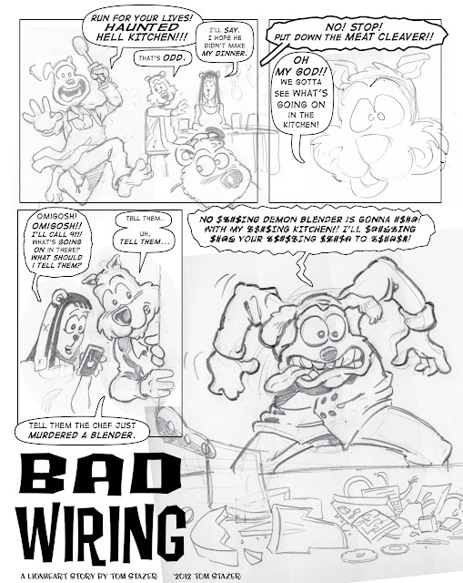
I will be adding some hand lettered screaming to lead into "run for your lives"

Sunday, September 23, 2012
Calling it a day
With no spaceship interiors and some backgrounds to think about.. hmmm.. less is more? Oh I hate putting in backgrounds. I never was good at environments, prefer my actors on a blank stage, 'cause drawing backgrounds is HARD.


inks, blacks, tones
Time to get backgrounds and hand lettering effects drawn and in place. This is the last stage of digital inks on this page i think. Process still developing.


live from the studio
Hot off the keyboards, the pencils in place for page 2 - inks in a few hours. Here's your first look at how i am scripting this to try to bring facts in sideways; hopefully the final panel connects this dining experience to the middle of page 1. the other two elements will tie in before end of chapter one. There's a flashback to a talk show coming on pages four and five that will really fill in the blanks. Exposition is a challenge to keep interesting, luckily all my main characters crack wise.
new font in place.
MISSING SOUND EFFECTS and AIIEEE that will tie it all to the first page

new font in place.
MISSING SOUND EFFECTS and AIIEEE that will tie it all to the first page

Saturday, September 22, 2012
next stage
At this point, the page is nearly inked and about halfway toned. I am going to try doing the rest of the drawing - backgrounds, characters in distance, wally wood spaceship interiors, by hand in ink then scan and fit in. It's been difficult doing things with thin, simple lines. Must hand letter some aiiieeeee and maybe all of it, scan and place. But pretty happy with where I am at. Page 2 is also underway and sketching to finish the page 2 pencils begins shortly.


Friday, September 21, 2012
the thumb
Since this interests a few of you, the thumbnail sketch that precedes the pencils shown below. This is created after the dialogue is nearly set in stone - or at least the timing of the dialogue. I have to plan each panel to lead eye into correct balloons and images, and to have enough information in the panel to get certain things across, like being in a kitchen. It usually changes on the way to pencils and this is no different. A funny drawing of Feast was too good not to use in the final panel; it changed the layout of the panel only slightly and for the better. His expression introduced a new plot element that the "play some soliatire" in-joke refers forward to. (anyone else know what movie this bit is referencing?) Also, the lower left panel needed to be flipped to get the second word ballon to work the way I wanted with the face.
Lookit me, Im making a making of.

Lookit me, Im making a making of.
Thursday, September 20, 2012
first page preview
I am posting the first concrete proof of a new story, but really more to document my first steps into this new terrain of computer assisted assembly. In the past I did it all on paper - thumbnail page layouts led to ruled and bordered bristol board pages, then hand lettered. Then pencilled upon, then inked. I had experimented with pencilling on layout paper, then backlighting it and inking that. Bad idea. In the digital age I sketch and then scan and then finish on computer. But I've never quite assembled a comic page in this way:
Sketches both impromptu and required by my story outline are scanned; then from the same hand drawn page layout thumbs I make an illustrator file of the borders. Then set the lettering in illustrator text boxes.. which is a huge boon and a huge curse. What is miraculous is the ability to resize text boxes and tweak line breaks infinitely; not set in stone like the ink days. What we lose is the spontaneity and personality of hand lettering - HUGE LOSS of one my distinguishing features, expressive text and word ballons. More on that in a bit.
Next the sketches are placed, masked, scaled, and overlaid until I get the balance of text and art and feel I am drawing the viewers eyes properly through the story.
I am doing this so that when I ink, all the images have the same "scale". In the past I have inked loose images then assembled them into a page, but found that scaling caused the inks to look inconsistent. As if I was using a variety of different brushes and pens.
Now, that text. ugh. It's cold, but so was EC comics and nobody whines. I think I may resort to an odd solution -- set it up like this, but print it out and redo it all hand lettering and scan back in. That wouldn't take long and would allow me to keep my distinctive lettering.
Anyway.. I shouldn't share incomplete, but I am not gonna complete this tonight (need aliens, word balloon tails, etc). The script is also not quite final.. especially the reverse text. Don't worry it makes more sense on the next page, but I am trying some new narrative tricks. Had to grab on first page, opening of story is kind of small. This is pretty WTF, yes? Old readers will see familiar characters; new readers will have it explained easily.

Tuesday, September 18, 2012


Monday, September 17, 2012
COLOR without mercy
While the new Lionheart story comes together, I am also spending some time on coloring the first-ever Lionheart tale, Zany But Deadly. I started this two years ago before my life did a quick implosion, and now that I am back on track the work resumes.
I fully accept that this is overdone; I fall prey to the same things that ruin so much of today's PSD coloring. I don't know if this color version will make it into the new Lionheart book or not. More likely will just be a PDF to be distributed digitally with the book. This is a dry run. the story i really want to color, the one most related to the new story, is the "Mad Cosmos" two parter that ran in Usagi Yojimbo.
So here's the latest page to be completed, page 4.. more as things unfold.

Friday, September 7, 2012
The Cat Came Back
I've been sketching Lionheart in free moments trying to access all those old brain cells that knew exactly how he looked. My "style" has moved dramatically since then, to my eyes. But slowly he is coming back into focus. Here's some pencils. The plan is, a new Lionheart story and maybe even a kickstarted collection with new and old stories.


Thursday, August 16, 2012
A new sketch
Hey folks -- long time gone here, and let me just say I've been a bit distracted with personal issues. Been drawing, and wish I could share it all, but as it is for actual production -- not until product hits shelves.
However, here's a lil hottie for you, part of a logo design project for a friend. The idea is, this gets turned into a CGI toon. Hmmm.
Anyway, for you all - both of my blog followers.

However, here's a lil hottie for you, part of a logo design project for a friend. The idea is, this gets turned into a CGI toon. Hmmm.
Anyway, for you all - both of my blog followers.

Wednesday, April 25, 2012
Samurai Slate coming along
Last night's cleanup of Slate - probably won't be able to work all these into the actual strip. Using virtual zip a tone. So easy.. so fun. And no sticky mess!


Inks of sketches
Just sharing the "finals" on this project -- will link to client web site when all is up.


Saturday, April 21, 2012
Rewarding Freelance
What fun!! If only freelance was more like this and less like reality. This is the halfway mark of creating icons for web links. They will be very small indeed so it's all about reduction of detail and using bold strokes. It's something I never was able to achieve till I hit my 40s. Somehow, whether through laziness or maturity, I found myself able to let go of cross hatching and zipatone and not worry about the shape as much as the idea it communicates. Work like this makes me smile when it comes out of me!! Make no mistake, I'd rather have Wally Wood's eye than Keith Harings. But I am proud of these little blobs of graphite.


Friday, March 23, 2012
A Work In Progress
Working, in fits and starts, on a fun project for Keith O'Brien, a stalwart cartoonist and animal lover, whose PostKards have enriched my mailbox for years.
http://www.facebook.com/postmasterkeith
A preview of how things come together when you work on them 2 hours every 4 weeks.
I had Sam all sketched out when I learned he has a roman nose and curly blond hair. Sigh.


http://www.facebook.com/postmasterkeith
A preview of how things come together when you work on them 2 hours every 4 weeks.
I had Sam all sketched out when I learned he has a roman nose and curly blond hair. Sigh.


SPACED, The Final Front Ear


From OLD BLOG: The Original Cattywampus!
I first used the name on a single panel effort, and man, do I mean effort. Telling a good joke - a surprise, a new joke - in a panel - is tough indeed. My admiration for the few masters of the medium grew even more. Here's the few I finished.


My sketchbook has another dozen or so ideas, but pulling them into a coherent gag that I was satisfied with often eluded me and the lack of any deadline or payment for the creation kinda made it too easy to not finish. Here's some sketchbook bits.


My sketchbook has another dozen or so ideas, but pulling them into a coherent gag that I was satisfied with often eluded me and the lack of any deadline or payment for the creation kinda made it too easy to not finish. Here's some sketchbook bits.

NO CHECKS!! BAD DOG!!
Inspired by a true event, where three of us saw a yard with signs posting "no checks" and "bad dog" and broke out in uncontrollable laughter. I think we all pictured something a little different; what I got out of it was "I told that stupid dog never to take checks!" Could also be an admoniton not to write checks. And maybe you had to be there.


"What the - it - it's made of Chocolate!! "What kind of SICK JOKE is this!?"
Dogs Don't Get Easter
As we all know, dogs are allergic to chocolate and only some sort of sick freak would make a delicious, yummy dog enticing bunny out of the dreaded bean.
Almost certainly my best gag for the series, but I never went back to it. Mark Martin later finished it up on facebook.

Sorry, pal, the sign says HAPPY hour.
Shortly after drawing this, I went - wait a minute - isn't this a Gahan Wilson Cartoon already? And lost it.


Why your cat doesn't come in when you call him.
I was halfway through this - the cat is behind a shed while owner calls - when I once again realized, wait, this is a Gary Larson cartoon already.
Maybe there will be more.
Subscribe to:
Comments (Atom)